
Football and tradition go hand-in-hand, but as the market for replica kits has proliferated over the past 30ish years, clubs have often stepped away from the shirt designs that define their visual identity to instead tempt fans with bold new ideas. But as most shirts only last a single season nowadays, experimental design are often followed up by more traditional garb. That, then, is the story of Geylang International’s 2023 jersey, which we have up for review in this article;
Of course, when it comes to Geylang International, we have to note that their stripes are certainly iconic within Singapore football, but not quite as old as casual observers might assume. From the inaugural season of the S.League up until and including the 2011 season, the Eagles of Bedok Stadium played in a variety of mostly green kits with white details. 2012 saw a suggested switch to maroon at home (a decision that, to our knowledge, was never properly explained) which was hastily cancelled in favour of a white shirt with a hint of green.
Only in 2013 was a hooped jersey introduced, but the styling stuck for years and made Geylang instantly recognizable in the league, in part because the only other team to carry green in their jerseys was Woodlands Wellington. The seasons came and went for Geylang until 2020, when the decision was made to replace the hoops with an Ajax-styled strip (one could also coin it a penguin style, perhaps), with 2021 and 2022 seeing further experimental designs. These, as well as the hooped kits worn from 2016 until 2019, have been previously chronicled on this very website via the articles linked below;
- 2016 GIFC Home Shirt
- 2017 GIFC Home Shirt
- 2018 GIFC Home Shirt
- 2019 GIFC Home Shirt
- 2020 GIFC Home Shirt
- 2021 GIFC Home Shirt
- 2022 GIFC Home Shirt
After three years of quirky, out-of-the-norm kits – an eternity in footballing terms – we now return to hoops for Geylang, so let’s see how they measure up to the jerseys of yore.
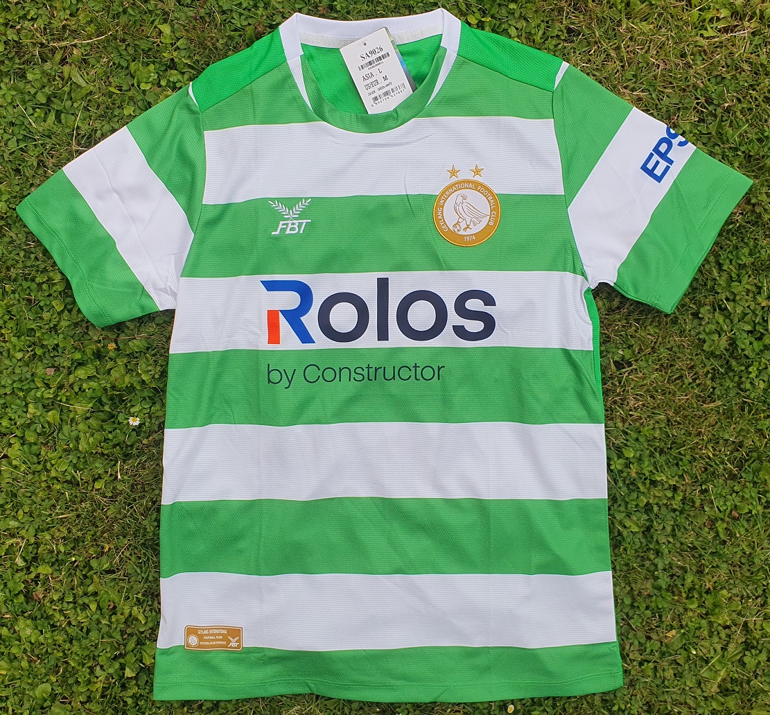
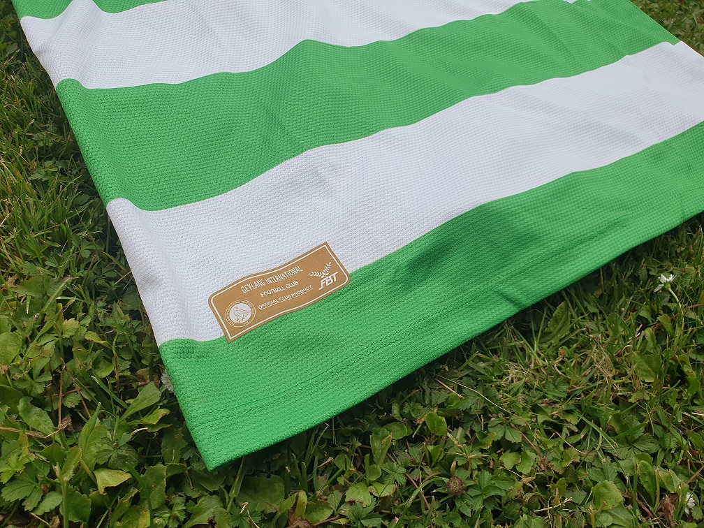
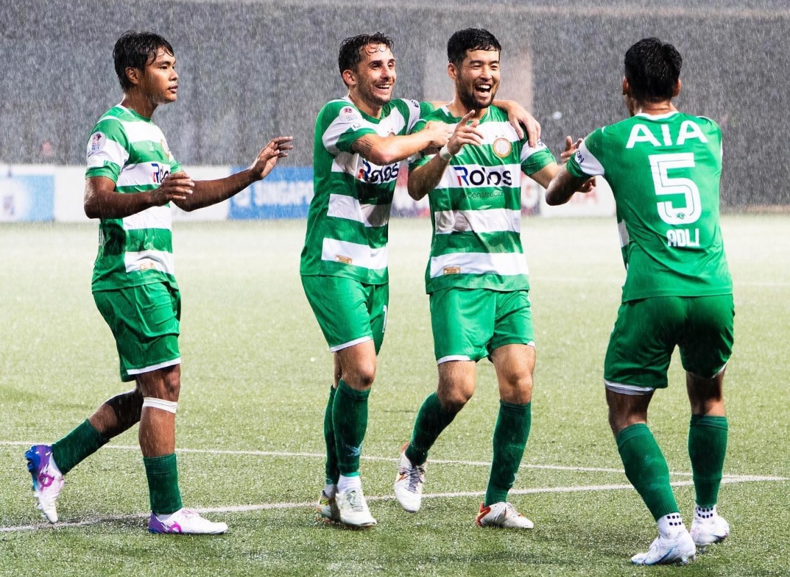
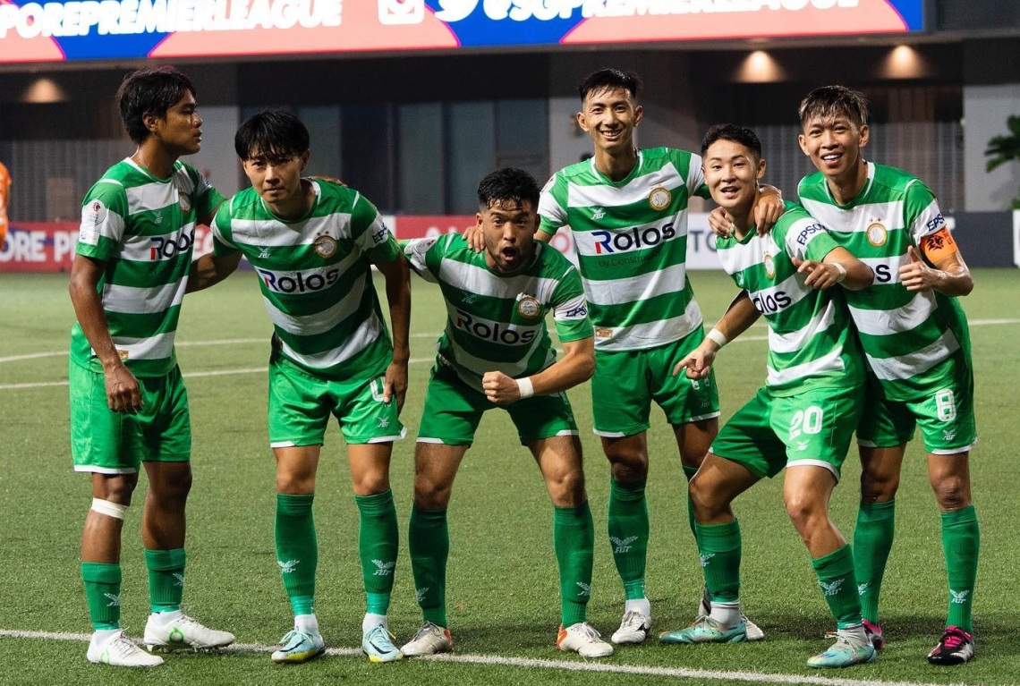
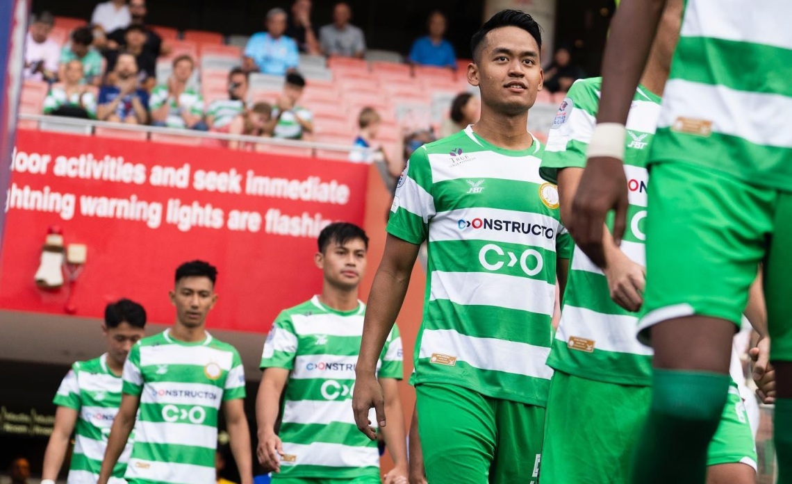
The change of sponsor is obviously the most eye-catching facet of the shirt when contrasting the 2023 design with those of the last few years. After all, Epson had become a rock-solid fixture on the chests of players, sponsoring every single strip from 2016. But beyond the new name now affixed to the front of the shirts, the stripes are back in medium green, alternating between white and green across the shirt.
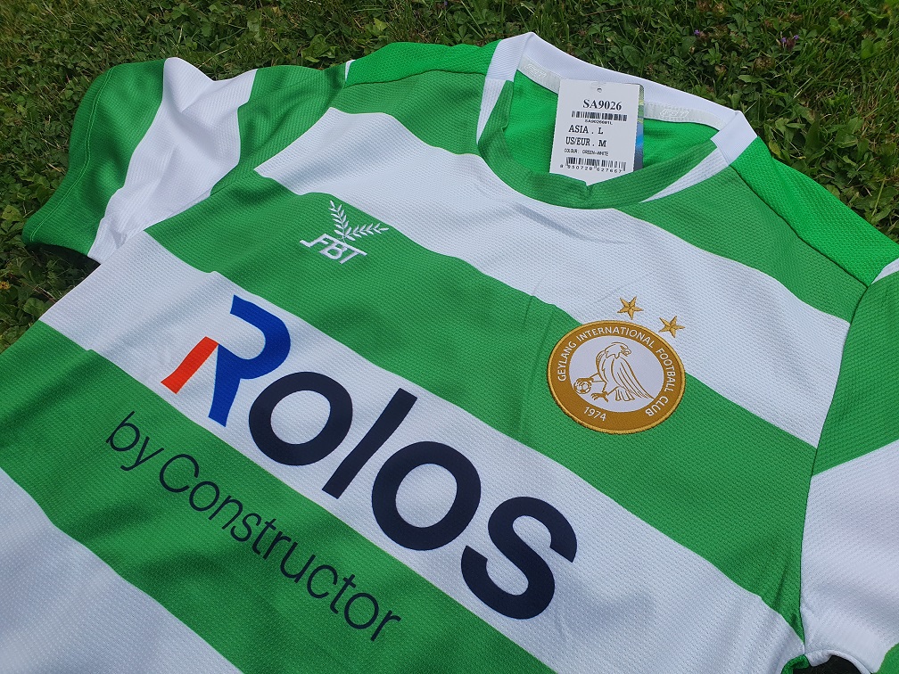
With the top hoop being green and matching the shoulders of the shirt, perhaps the best comparison to make here is to the Thorb-designed shirt of 2016, which had a broad green panel across the upper chest with the familiar Eagle crest sat on the highest white hoop. 2023 plays things thing differently, with the crest instead sitting mostly across a green hoop, with only its upper edge encroaching upon the highest-placed white hoop. This seems to be a feature of all adult shirts regardless of size; ours is an Asian size L / Western size M, but both the smaller and larges sizes worn by players and fans have the crest across multiple hoops. A marked change from most previous FBT-supplied jerseys; only the thinly-hooped 2018 shirt had the crest across multiple hoops.
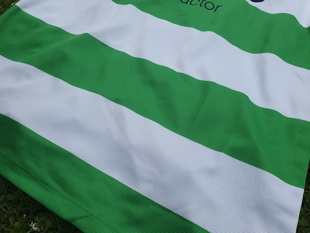
The stripes continue all the way down to the bottom hem of the shirt, with the final hoop on the Asian L-sized tops being green. There are no frills, bells, or whistles here; these are straight, no-nonsense hoops and really contrast with the wild designs worn in 2020 (‘the Penguin’), 2021 (‘the Headache’), and 2022 (‘the Minty Delight’).
All in all, there are seven uninterrupted hoops on this shirt; four white, three green. For the sake of clarity, we define ‘uninterrupted’ as a full-bodied stripe that is not cut short by the bottom hem or the shoulder panels (the collar cutting in, however, is allowed). This is the same number as on the 2017 and 2019 shirts, albeit those had four green and three white hoops. 2016 had eight hoops, and 2018 had more than we care to count.
We hate to go for the obvious here and bring Celtic shirts into the discussion, but the Glasgow-based club is, ultimately, the most famous team in the world to play in hoops (green and white ones at that), and the Scots typically use much thinner and darker-coloured hoops for their shirts – just look at their recent kit history. Geylang, in contrast, seem to stick to thicker hoops, although the jury is out on whether this is a concious design choice every year, or just a bit of a coincidence. It should at the very least put any accusations of copycat behaviour to bed, and lets Geylang retain its own visual identity for its recent hooped shirts.
Another question to be answered is this; how do we actually feel about the return to stripes? They have become umbilically tied to the club’s identity, but we’ve been really spoiled by three very different, unique designs in 2020, 2021, and 2022. The return to hoops, while not surprising, feels odd in that sense. We like tradition, and we always applaud sticking to it, but then why are we not *that* enthusiastic about the hoops now? The most likely answer is that, due to the daring designs of the previous three seasons, simple hoops are just less exciting. We almost feel bad coming to that conclusion.
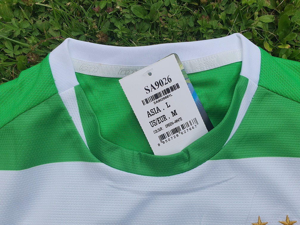
As the Editor-in-Chief continues to have an existential crisis triggered by his feelings over a football shirt, we must point out that this year’s collar is quite an interesting one, unlike anything seen over the years. It’s fairly simple one on the face of it, just a crew-styled collar in terms of construction, but where the reverse half is made of the type of stretchy fabric you typically see in collars, the front is made of regular non-stretching green polyester, with a white design sublimated along the sides.
This gives the impression of the white part of the collar tapering off as it continues along to the front of the neck where it is eventually pinched out by the green.
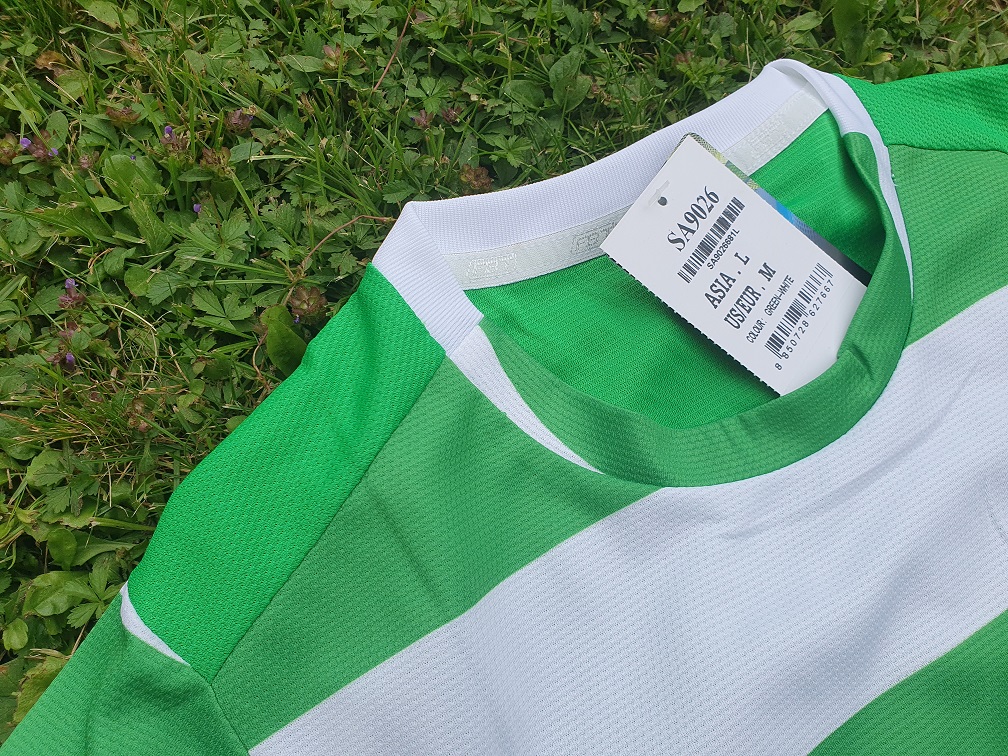
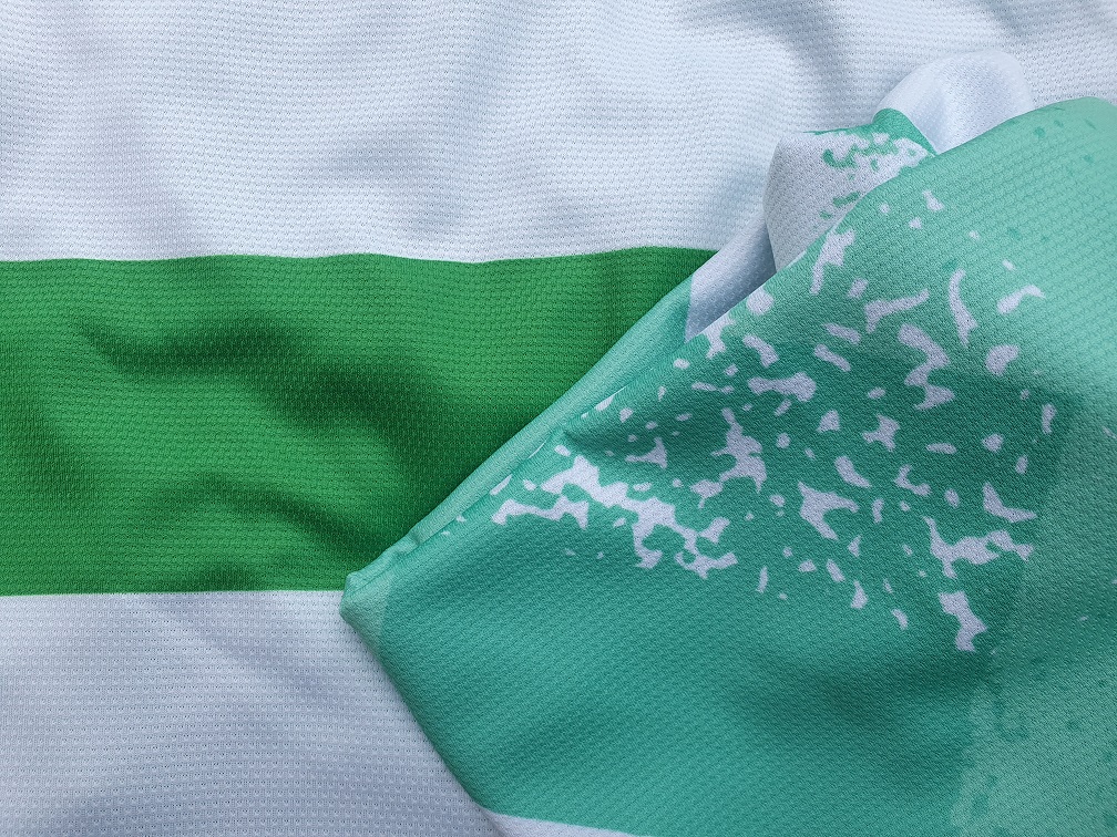
A similar flash of white is visible at the seams between the shoulder panels and the sleeves, which similarly gets pinched out by the green, but the most interesting thing to spot here is the difference in shade between the green used for the hoops and the collar on the one hand and the shade used for the back/shoulder panel on the other. The latter is, noticeably, a bit more vibrant – just a tinge lighter.
Why are there two shades here? Because the back and shoulders of this shirt are made of green fabric, where the front is actually white fabric that had the green hoops sublimated. Trying to get the dye to be the exact right colour via sublimation is extremely tricky, and explains why the shades approximate eachother here, but are still visibly different when pointed out. The average person won’t care enough to spot the difference, but it’s absolutely something that needs to be pointed out on a blog dedicated to micro-analyzing shirts.
Whether this difference between shades is a problem is up to personal taste, but it is something that the 2019 shirt – the last shirt to sport hoops before 2023 rolled around – also ‘suffered’ from, and to a much greater degree at that. The benefit the 2023 shirt has is that its sleeves are also sublimated, meaning that the shade of green there matches the hoops. The 2019 shirt used the same fabric for the sleeves as it did for the back panel, meaning that the sleeves didn’t match the sublimated hoops and thus made the difference way easier to spot.
For us, its not a dealbreaker, but ideally, for future shirts, FBT/Panyasingha would do well opt for sublimated hoops on the reverse of new shirts to ensure that the tones used across the shirt are fully congruous. However, since the start of their tenure with Geylang in 2017, the backs of all kits have been plain green so we may be waiting a while longer still. Using green fabric for the front and sublimating the white would be a suboptimal alternative, as white dye is much harder to sublimate with – the green base would bleed through and give the white a faded green look.
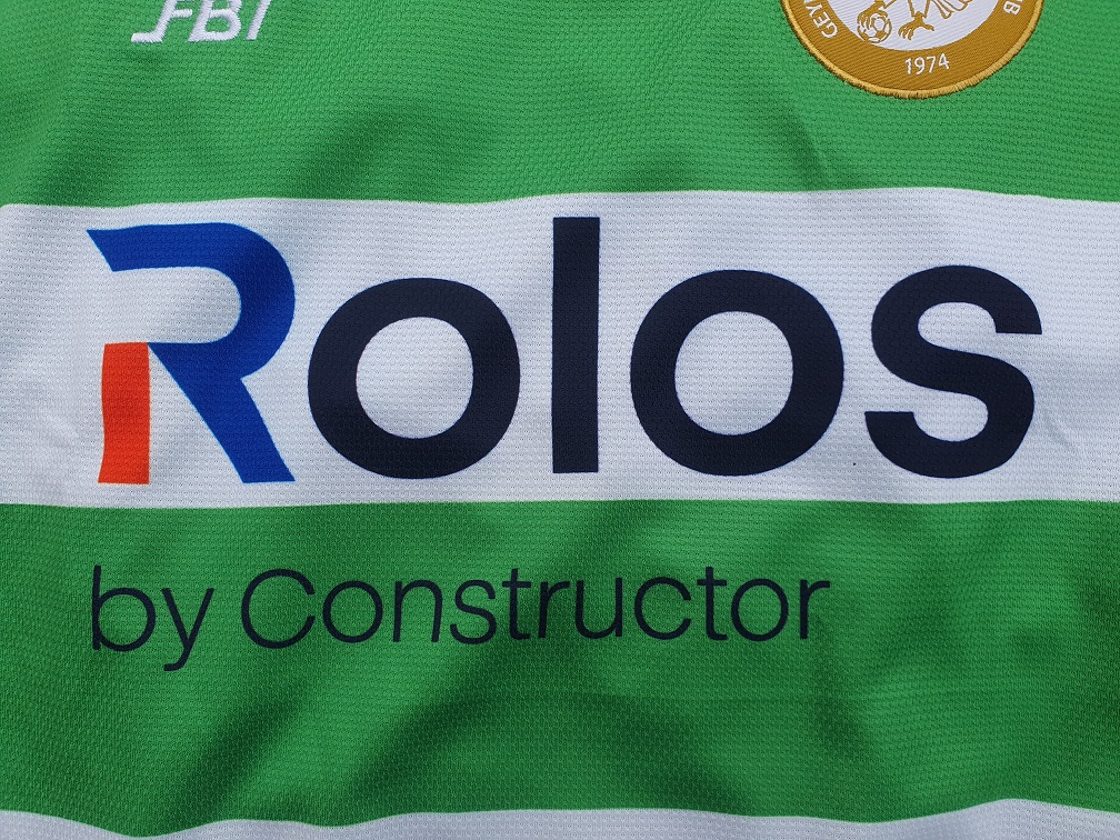
Talking about sublimation, for the seventh year in a row we have a sublimated sponsor on the front – always a pleasure to see. And for the first time since 2016, it’s not Epson! AI firm Constructor Group paid Geylang 500,000 Singaporean Dollars for the privilege of advertising its products on the front of the home and away shirts, with Rolos being the first of its wares to feature.
Rolos is a Machine Learning (ML) platform meant for use by business, academia, and sports teams to churn out data-driven insights relevant to their goals. From what we can tell it’s a Software-as-a-Service (SaaS) not unlike Microsoft’s Dynamics 365 suite of products, although it might also be considered as a Platform-as-a-Service (PaaS) available for cloud and on-premises deployments.
The jerseys sold to fans at the start of the season all featured the Rolos wordmark, which strikes a pleasant balance between providing a small touch of colour via the red/blue R whilst simultaneously not dominating the shirt thanks to the rest of its name being in black.
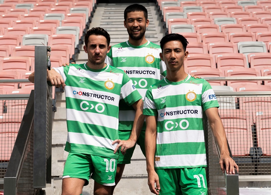
Then, on the 5th of May, a press release authored by the club revealed that a new deal with Constructor Group had been inked, with their sponsor outing on the shirt being changed to display a new logo – dropping the Rolos name entirely. Additionally, collarbone sponsorship returned for the first time since 2020 with club partners True Fitness Singapore and advertising agency Redhill seeing their wordmarks stickered across the upper torso of the home and away shirts.
To our knowledge, this version 2.0 of the 2023 home kits is not on sale, with kits bought from the club still carrying the ‘old’ Rolos branding instead. It’s not unusual for Geylang’s configuration of sponsors on playing kit to change over the course of a year, but this is the first time we can think of that the main sponsor decided to change the way it used the front of the chest. From a collector’s perspective, we might have to get in touch about acquiring one of these new spec shirts at the end of the season via the club.
The ‘new’ shirts made their debut on May 7th against the Lion City Sailors, meaning that Rolos only made eight appearances on the first team’s shirts. With Geylang International having played 15 out of 24 league matches this season at the time of writing, we may yet see another change later in the season.
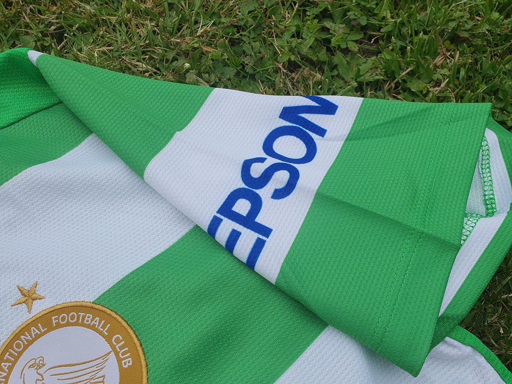
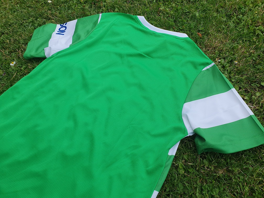
Traditionalists will be pleased to see that Epson, while no longer main sponsors, still retain a spot on the kit elsewhere, with the left sleeve now sporting their wordmark in their corporate blue colour – the first time since 2016 that the wordmark has not been recoloured to white or black to suit the shirt’s design. What’s more is that it has been sublimated rather than stickered – a first for the club, as every other single Geylang shirt in our collection features stickered sleeve sponsors instead. Hopefully sublimation will be the norm going forward for at least some sleeve sponsors, although we’d not be surprised if player kits continue to gain additional sponsors throughout the seasons.
The usual jocktag also returns, unchanged in this exact configuration since 2021. As with the 2022 shirt, no embroidery features opposite it on the bottom left hand corner of the jersey. No tricks with the bottom hem this time, unlike in 2022 – the green hoop simply wraps around the bottom.
It’s also worth shouting out quite how traditional that shade of green is when compared to the minty shades used in 2022 – a world of difference really, both in tone and in design. The fabric used is the same across both shirts though, and has been in use since the original FBT-made Geylang shirt released all the way back in 2017. It is a little susceptible to pulls and nicks, but it’s supremely soft to the touch and comfortable to wear as ever.
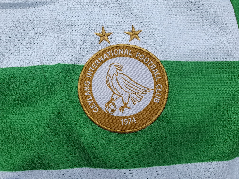
We’re also still using the gold version of the club’s crest here, with the two stars denoting the club’s two S.League titles still taking pride of place above the eagle. They debuted on the 2017 shirt, and benefit from their positioning over the white hoop, which makes them stand out just a little bit more than usual.
One note to make here is that the crest seems to have been sown on slightly off-centre – if you look carefully at the eagle mascot and the year of founding, you can see that they seem to be slanted slightly, as if the crest had been rotated every so slightly counter-clockwise before being sown onto the shirt. This is an issue which seems to have affected all kits in the initial batch supplied by FBT, and which has seemingly been rectified on 2.0 version of the shirt in use since the start of May. Nonetheless, this falls well short of FBT’s usual standards, and we really do expect – and demand – better from them.
Flip the shirt over onto its belly, and you can perhaps see more clearly what we meant about the two different shades of green – the back is very obviously a lighter green than the sleeves and the front, and this is much easier to observe as on the front you mostly only see the darker tone.
The FBT-made home shirts have never had hoops or embroidered details on the reverse, and this continues to be the case in 2023, leading to a relatively threadbare look here. The simple white collar doesn’t help much, in this regard, where in 2022 at the very least the black and gold added ever so slightly more.
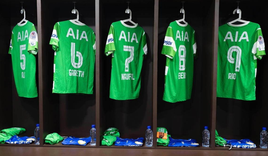
Once player printing has been applied, the shirts have a bit more going for them. White names and numbers replace the black used in 2022, whilst AIA’s wordmark remains stickered in white. The usual rounded league patch is applied to the right sleeve, above a league-mandated outing for Singapore Pools, the state-owned gambling firm that allows punters to place bets on league matches and feeds its profits into initiatives that support Singaporean society.
With it now being July already, the league is already past the halfway mark with Geylang having played fifteen matches to date. These are, as has been the case in recent years, hosted at Our Tampines Hub by the Eagles, the stadium-annex-mall-annex-community centre they share with Tampines Rovers. Bedok Stadium remains in use for youth matches and community activities, but all match action plays out exclusively on OTH’s astroturf surface under the bright lights – and the odd downpour.
Matched to green shorts and socks, this year’s shirt has seen some early success. Where Geylang languished near the bottom of the table this time last year, in 2023 the Eagles have spent most of their time in fourth place – a fair ways behind Albirex Niigata Singapore, Tampines Rovers, and Lion City Sailors, arguably making them ‘the best of the rest’. Balestier Khalsa have leapfrogged the Eagles at times, but the latter’s recent 2-3 win over the former at Bishan Stadium have Geylang ahead by a solitary point.
Given that Albirex are their usual selves and Tampines and especially LCS have higher playing budgets than Geylang International, fourth is a good spot to sit in – especially as it could yield an AFC Cup ticket come the end of the season (provided the Singaporean Cup champion qualifies through the league as well, or is called Albirex or Young Lions). Let’s not cheer prematurely with nine matches left for the squad to play though, there’s still a long way to go.
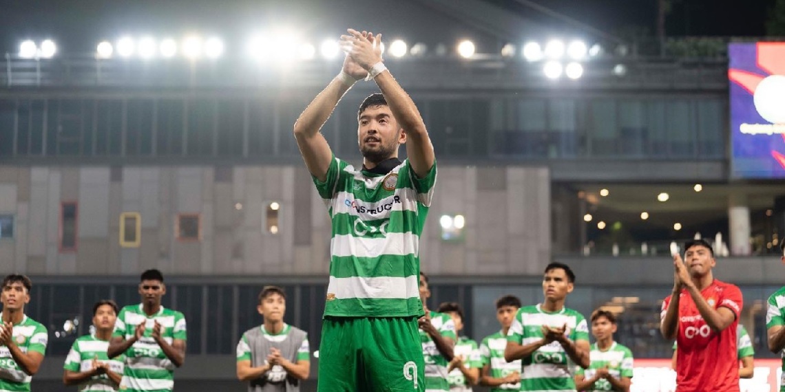
Perhaps the Eagles are reaping the benefits of having retained the core of the 2022 squad that so valiantly clawed back the early season deficit to finish fourth. Three of the foreign imports – Rio Sakuma, Takehiro Tezuka, and Vincent Bezecourt – remained with the club as only Šime Žužul left (for Uzbekistan, of all places). Žužul and Sakuma had become good friends over the course of 2022, and the latter actually now carries Žužul’s number nine in honour of the Croat – a bemusing but touching hommage, considering Sakuma is a central defender.
Goalie Zafiul Nizam departed for Hougang, as did Umar Ramle and Hazzuwan Halim, while Tajeli Selamat returned to Lion City Sailors, but Geylang benefitted from bringing in players Amirul Adli, Akmal Azman, Gareth Low, free agent Iqbal Hussain, and Japanese forward Yushi Yamaya who slotted into the void left by Žužul.
2023, then, has held plenty of intrigue for fans of the club and may yet spring a few more surprises. If the linking with Constructor Group was a momentous occassion, then a superlative might be used to describe the club signing a partnership with the City Football Group, that international network of partner clubs that tend to play in light blue. Perhaps ominously, this year’s Geylang away kit is light blue, although this has traditionally been a popular choice for alternate kits anyway.
The club also attracted a new vice-chairman in the form of Shi Kan, the CEO of CUE Group who promised to leverage personal assets and business experience to help the club improve its processes and grow its standing within Singapore. Both Shi and the club have very cautiously mentioned the possibility of privatisation, a process that Home United went through to become Lion City Sailors following the introduction of Forrest Li to its board of directors in 2019.
While an exciting prospect, we also dread to think what might happen to Geylang should they go down this road. Will its name, colours, and history be lost in the same way as how all of Home United has been consigned to history? Would this be right for a club that has been so integral to Singaporean football, a status it attained almost immediately after its founding in 1974? It cannot be denied that the Sailors greatly grew their fanbase which was at the very least in part down to the rebranding, but would such gains be worth the sacrifices for Geylang International? Perhaps so, and we trust the board to make the right decisions for the club’s future, but the club losing its name, identity, and its beautiful green and white shirts would inspire deep despair in us.
We can only wait and see. And feverishly hope that come March next year, we have a new article about a new Geylang International shirt to publish. Thank you for reading, Geylang Boleh.

4 Comments